Conclusion

This module has been at times the most frustrating and difficult I have so far taken but I think has produced the work I am most pleased with due to the effort I have had to put into it. The hugely steep learning curve that comes with 3DS Max has been very difficult to overcome and I have found myself watching endless youtube tutorials in an attempt learn how to use the program. With no prior 3D animation knowledge and limited 3D modeling knowledge I knew the second part of this module was going to be difficult so I took a conscious decision to make my models as simple as possible. This was in an attempt to make the animation as easy as possible. I used much more basic materials (than in the first part of the module) that would deform more naturally on my character than more complex materials.

However I made the mistake of making the limbs on my characters far too thick. Due to their thickness their range of movement was very limited. My inexperience animating was the reason I made this mistake. It proved to be my biggest problem throughout the animation process and something I would definitely change if I were to do the module again.

I used 3 lights for my scene, 1 omni light, 1 spot and 1 skylight. The skylight gives a very natural effect with great shadows but dramatically increases the render time. I decided to stick with it because I knew I would regret it if I had removed it. The spotlight emitting from the lamp is particularly effective in lighting the scene and was very happy with the look it gave.

As I have previously highlighted I made the arms and legs too thick to achieve a good range of motion that limited my animation. I think I managed to overcome this problem quite well in the end. The skinning stage was quite frustrating with random vertices moving with bones for no apparent reason but when it finally went according to plan it was a good feeling seeing the models come to life.

I used a variety of different camera shots mixing long shots, aerial shots, close ups and a point of view shot.   Having the freedom of getting any shot I wanted was something I enjoyed, im sure it will make going back to actual video producing feel much more restrictive.

I think the weakest area of the animation was the sound. I learnt finding sounds that were appropriate was very difficult. Amongst others I ended up using two songs from Toy Story, people often said that my character and scene reminded them of toy story so I decided to continue with these connotations by using the songs from the films. I wanted to give the idea that my animation could fit into a scene of Toy Story.

I have learnt the basics of animating in 3D during this module and feel that I have gained a good foundation that I can build on in future projects. I have enjoyed gaining the new skills and pleased with the work I have produced.
Final Animation


So after rendering around 1600 frames at between 1:30 - 2 minutes per frame the animation is finally at a point where im happy with it.

Editing in Premiere Pro


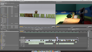
Once all the parts of the animation were rendered I was ready to edit them together in Premiere Pro. It was a nice feeling going back to a program I was very familiar with after the frustrating struggles with 3DS Max. I started by importing all the rendered scenes, both the .mov’s and the bitmap still’s that I had rendered. I trimmed the clips to required lengths and dropped them into the timeline.

After I had my moving clips where I roughly wanted to be I then placed the bitmaps on the timeline. I used bitmaps for when the animation was still because there is no point rendering still motion. By using bitmaps I was using a lossless image type so the stills would not be noticed. I then went back to max and created an intro still which I thought to be much more effective than a simple photoshop graphic intro.


I used ‘fade to black’ for my transitions where I have used them. I used a fade to black with a black screen for a few seconds in order to show a period of time passing after the character is sewing his heart.

I then created a thought cloud in photoshop to show my character having an idea. I can create this directly from Premiere Pro by selecting File > New > Photoshop file. This opens up photoshop with a canvas the perfect size for the video. This also allows me to edit the file and the changes are made in premiere when the file is saved which is a good example or Adobe premiere pro & photoshop integration.


Finally I gathered sounds for my animation. This was an area that I had neglected prior to this point. I searched through a huge range of websites in trying to find suitable sounds. This was very frustrating at such a late stage because the perfect sound was never to be found. If I had allowed more time I would have liked to record my own sounds. I set keyframes in the effects control window for the sound and lowered the volume of keyframes to make the sounds transition. 


I then exported the video. I exported using the H.264 format which has increasingly become the standard for web video because of its very good compromise between quality and file size. I set the target bitrate to 15 which would again give a high quality video and reasonable file size. 


Finally I uploaded the video to youtube to upload to this blog. 

Rendering Problem

The Rim of the hat was not rendering at all. I eventually found that the material needed to be set to 2-sided to fix this problem.


Rendering

After animating I had 11 different files that would require rendering. I was rendering after I finished each scene to make sure I didn't run out of time. I decided to render at a 16:9 resolution of 1067 x 600. I chose this format to give the animation a more cinematic look. My scene had 1 skylight and 1 omni light, I set the ‘rays per sample’ for the skylight to 12 which was a good compromise between quality and render time. Depending on the specific scene I was rendering each scene between 1:30 and 2 minutes. I did make a few mistakes whilst rendering, I had to re-render a scene because I forgot to turn on the omni light which was highly frustrating. I also had to re-render a scene due to me not hiding the biped which was poking out at the feet. From these errors I made sure I checked everything before hitting render and leaving it to run. For times when the animation is still I rendered a bitmap image so as not to waste time rendering still frames. 


Animating

Once I had completed modeling the scene and skinning the characters I was ready to start the animation. Having no prior experience animating in 3D in any form I made sure completed many of the tutorials and watched some appropriate videos on youtube.

The first part of the animation involved the character running up to the chest of draws and climbing up. The initial sequence had the character running and hitting a ball which rolled away, then jumping over a (aesops fables) book then walking up to the draws. I created the run/jump/walk sequence in footstep mode then converted the keyframes to freeform animation so I could then animate the climb. Getting the climb to look natural was the difficult part whilst also trying not to have the limbs intersecting with the drawers. Because the next scene involved more walking I had to save the scene and copy it because if I converted the keyframes back to footsteps mode I would loose the climbing animation. When I opened my copy I deleted all the previous keyframes which allowed me to enter footsteps mode and proceed with similar steps for the next part of the animation. 


My character interacts with 4 different objects throughout the animation and I used different methods to achieve this. For the hat I set the start keyframe with it in the box and the end keyframe with it on the characters head. I then went through and set the keyframes in-between to make the hat appear in the hand. I was going to attach the hat to the hand by using a dummy but the animation looked convincing using the method I used so I decided to use the dummies later on. When the animation cuts to a close-up the character leans forward again into the box and the hat is still on his head. To do this I created a new file and attached the hat to the head using the select and link tool, I had to create a new file to do this because the hat is attached from the beginning of the scene which would have caused the prior animation to stop working. 

When animating the part with the heart & sewing needle I used dummies to make the objects move with the hand. I set the link constraint for the objects and added the links. Which connected the objects to the hands and allowed them to move together. 

*to be updated*

Test Render_1

I wanted to produce a render to see how long it would take. This is an initial animation test. Having a skylight in the scene provides a much more natural lighting but dramatically increases render time.

Learning to Walk

After skinning my character I could now start to experiment with the footsteps mode. My initial thoughts on the footstep was that compared to most other functions of 3DS Max it was relatively easy to use and implement. Getting my charcter to walk, run and jump was quick to achieve, the difficult part came when I wanted to mix footstep mode with normal freeform. I soon realised that I had to convert the footstep keyframes into freefrom keyframes, this however meant once I converted the keyframes i could not go back and edit the footsteps easily. This also meant that my animation would have to be in more seperate parts when mixing the different parts of the animation (i.e walk - do something - walk - do something - walk)

Sack Model & Scene Merge


I decided to merge the model & scene to ensure that the models were in correct proportion to each other. I did however find the problem that when importing the chracter to the scene its materials werent automatically put into the materials libary. To overcome this I exported the material libary from the character and imported the libary seperately through the materials window. Now I must finish the scene & copy/modify the model to create the second female character. Once that is complete I can commence animation.

Sack Character development 2

My sack model below is now almost complete. The standing pose shows the skinning to have turned out well however in the sitting pose a few problems appeared. The arms have a few sharp points when moved to their maximum amount of avaliable movement also something on the left arm is effecting one vertex on the lower part of the head which can be seen in the image below. These problems only require small modifications to the skinning. I am quite happy how the model/biped/skinning has turned out and am now confident enough that the model will work well when it comes to animating it. I do however have the problem that becuase of the nature of my character there is not the same level of movement in the limbs that a normal human shape would have. This is due to the 'chunky' nature of the body, hopefully it wont cause me too much trouble in the animating phase.

To create the background & lighting for these renders I used this tutorial


Gun Animation

Tutorial excercise.

Model Skinning Development 1

After completing the models body (exluding the eyes) I inserted a biped and began skinning. I could certainly foresee problems with the skinning phase so I wanted to get this part done as soon as possible. Initially I inserted the biped which didnt require much modifying. I removed the fingers & toes from the biped as my character had no need for them, I also removed a spine link.


After watching all the appropriate tutorial videos provided I then started skinning the model using the skin modifier. Again becuase of the simple nature of my model the process was not too difficult. Once I set the initial weights and started to test the movement I was pleasently surprised with the deformation & movement. The further tweaks to get the deformations to the point I was happy with however took much longer.

Scene Development 1

In order to get the scale of my character model correct I created the major parts of the scene. I started by creating the chest of draws which would act as the main platform where the action will take place. The drawers were created by making a box and simply extruding polygons. I used a wooden image diffuse & applied the same image for the bump to give it a realistic wooden look. I applied a UVW map which allowed me to manipulate the material further. I also created the drawer handles and made a golden material for them. 


The lamp provides a visual source for the light & creates an effective lighting style. I created the lamp by starting with a cylinder and extruding out from the cap, the angles were created by using the 'hinge from edge' tool.  Finally I created a cone and extruded inwards to create a space for the light bulb. For the bulb I set the material as self illuminating which gave the effect that the light was on. I finally set a target spot to make the lamp actually provide the lighting for the scene. I adjusted the intensity & falloff to create the required lighting.

I will now create some objects on the floor of the scene that will provide obstacles that my character will interact with at the beginning of the animation.


Sack Model Development - 1

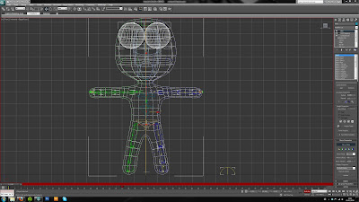
After creating my reference images I began modelling.  I started by creating a box which would form the body of the character, I then extruded out the polygons for the limbs and head. I moved the vertices to create the shapes I wanted. The model was kept as simple as possible so that when i came to the skinning stage the task would not be too difficult.

Concept art & Reference drawings

Inspired by the characters from "little big planet".


Storyboard

This is the storyboard for my interpretation of the fable "the lion in love".

More to follow.

The Lion In Love

I have decided to produce my animation based on the fable "The Lion In Love". I am going to switch the characters in the fable to sack toys after being inspired by the film "9"  & the video game "Little Big Planet". Next I will produce a storyboard for my idea.

Aesop's Fable - Initial thoughts & Ideas

My first task was to read through the Aesops Fables and pick out a few that were of interest. So far there are 3 fables that have initially caught my imagination. The Wolf in Sheeps Clothing & The Sick Lion both contain quite dark morals which would allow me to create an interesting atmosphere & feeling in the animation. The other fable that I found interesting was The Lion in Love. I think this fable would be a good oppertunity to convey emotion though expression.

Im not looking to take the fables too litterally. I will definatly look at taking an abstract view and substitute animals & people with possibly more unqiue characters.

I think now I will continue to read through more fables and see if any more stike me as possibles.